launched last week, has been in the works for several years. Like any comprehensive design project, it presented many challenges — compounded, in some regards, because I’m the client — but in the end, it’s been great fun and I’ve learned a lot.
The primary function of this site is, of course, to present samples of my work. The first site I published, in 1995, did that reasonably well; technically, though, it had grown a bit long in the tooth.
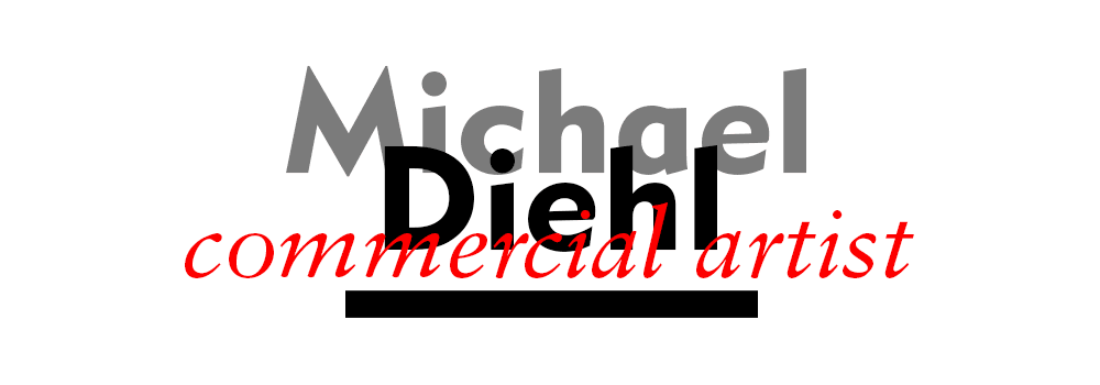
The splash page of that site (main graphic above) announced me as a Commercial Artist — an archaic term, to be sure, but one that speaks to serving two masters, Art and Commerce.
Plus, it suggests a generalist approach. So-called marketing gurus counsel designers to specialize, but I never have. Over the course of my career I’ve designed advertising, books and journals, logos, album covers, web sites, typefaces, movie props and more. I enjoy working in all of these areas. But more to the point, I do not distinguish between them as many do. Fundamentally, all of my work is about giving visual form to ideas, with the purpose of communication.
An early mockup of the site redesign spoke to this notion:
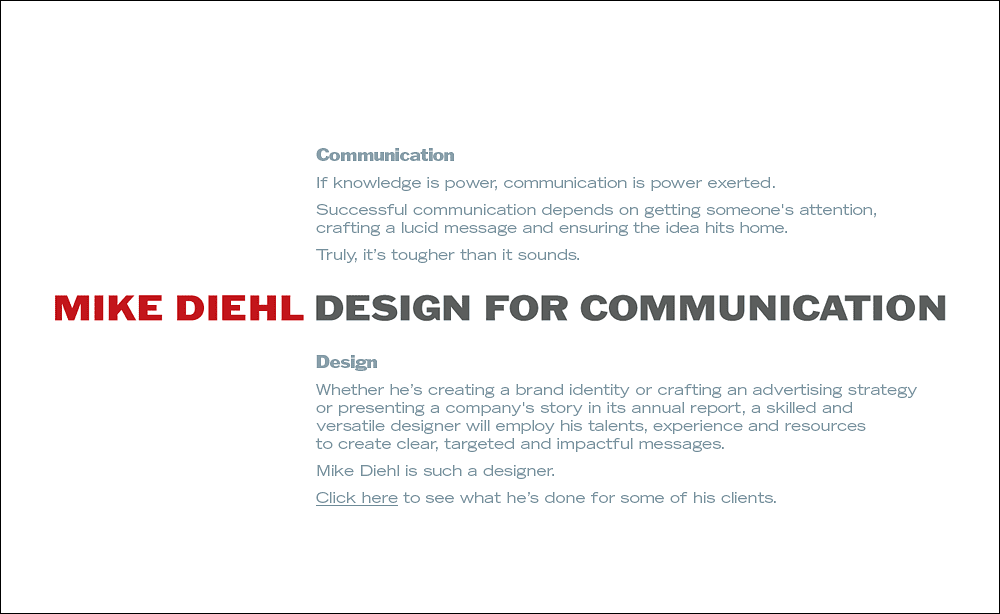
As a brand message, “Design for Communication” works well enough. However, it seemed limited, and limiting. I thought my new site also should reflect more of who I am as both a designer and a person; after all, I am a sole proprietor, so my clients experience me personally as much as they experience the work I produce.
A subsequent iteration of the site featured two main menus, “The Man” and “The Work.” Here’s a mockup:
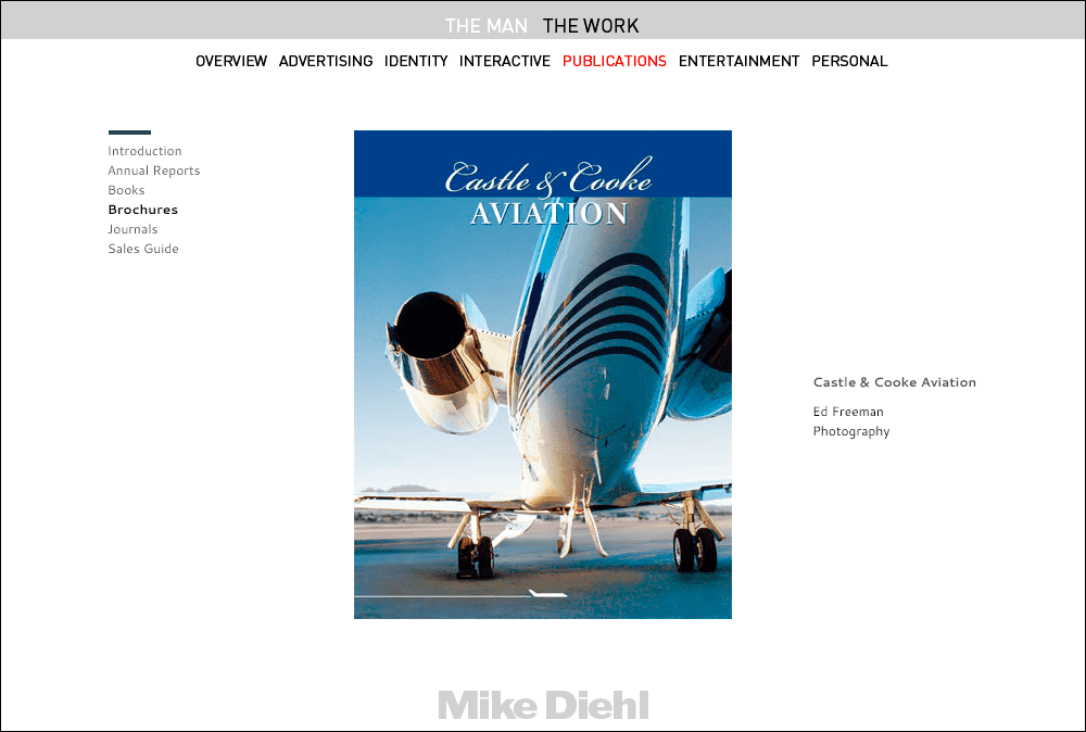
That conceit had its appeal, but while it addressed my desire to present more than a portfolio of work, the execution was just too complicated. Note that any given piece of work is three or four clicks away (in this example, The Work : Publications : Brochures : project). Practically speaking, implementing this design would’ve been enormously costly and time-consuming, and tedious to maintain. Most importantly, though, the Man/Work delineation came to seem a bit stilted.
The project was abandoned in this state for quite some time.
Then, a year or so ago, it dawned on me that, rather than being primarily a catalog of work, exhaustive in detail and laborious to present, the site should be simpler. But primarily, it should be fun for people to look at, and fun for me to produce. To me that meant it should feature only projects I’ve loved doing — including images I’ve made just for fun — and only the type of commercial work I do best. In the end, I determined the pieces didn’t need descriptions, dates or client info; they could stand on their own.
This “design spec” inspired me to include more unpublished and personal work and exclude projects that, while notable for the name value of the client or the visibility the piece might’ve had, just didn’t reflect my best work — and more importantly, the sort of work I aspire to do more of.
The original vision was to present a single slideshow, reflecting my belief, articulated above, that my work in the aggregate speaks to what I’m capable of and who I am as a designer. You can experience that by viewing All Images.
In the interest of creating an easy way for clients looking to see only logo designs, for example, I’ve classified the work into categories echoing the terms on my home page. To Brand, Persuade, Inform and Entertain I’ve added Props, pieces I’ve designed for movie and TV productions, and Fun, personal work of various flavors. There is, inevitably, some overlap; for example, a book I co-designed, Monty Python’s Life of Brian, is certainly meant to entertain, but it contains volumes of info about the movie and the Pythons.
The limitation with this approach is depth — allowing a visitor to see multiple spreads of a book, for example, or various components of an album package. I plan to use this space to present projects that warrant such coverage.
As to this Musings section, I’ve always loved to write, and having a blog is thrilling — and daunting as well. This is only the second post, in as many weeks; I’m sure the pace will slow, and equally confident I’ll enjoy writing occasionally about my work, and design matters generally.
That said, the thing I struggled with most throughout the site redesign was writing about myself. After reading a few of my attempts to self-promote, my collaborator on this site, Paul Volk, diplomatically suggested that, instead of blowing my own horn (or merely blowing smoke, it’s hard to tell sometimes) I should let others speak on my behalf. Fortunately, many clients have written many nice things in emails over the years, and I’ve published a few of those on the Hat-Tips page.
For those who know me and/or my work, I hope you agree the site accurately portrays me professionally. For newcomers to the site, you now know my intentions, and hopefully can better appreciate what you see and read here.
Acknowledgements
I owe an inestimable debt of gratitude first and foremost to my longtime friend and collaborator — and wizard coder and designer — Paul Volk. Without his help this site would exist still (and perhaps forever) only as Photoshop mockups. Paul and I met on a CompuServe type forum in the late ’80s. We worked together initially on a project for the Los Angeles Times, and subsequently established a digital type foundry, Diehl.Volk Typographics. Since the early 1990s we have worked on an assortment of projects in a range of capacities, most recently web site design and implementation. Our enterprise has been rebranded Diehl.Volk Labs.
Thanks also to longtime friends Giff Crosby and Nicole Cranberg. It was my great fortune to have been teamed up with Giff on my first day of my first job out of college, at the New York ad agency Marschalk. We hit it off immediately. Giff is a great copywriter and went on to perform creative magic for lucky clients at several New York agencies. Nicole is a formidable writer, too, and also spent years creating advertising in New York. Nicole and I have brought one another projects on which to collaborate, and Giff and Nicole both have assisted me tremendously to “define my brand” and to help develop concepts and copy for self-promotional items, including early versions of this site.
A tip o’ the hat here to Bob Conley, who counseled me on career matters, and who first encouraged me to define and pursue my “sweet spot,” areas in which I most enjoy working, and do my best work. That guidance informs the selection of work I’ve shown on this site.
Finally, but ultimately all-important, a deep bow to my clients, without whom there would be no commercial artwork to show. I’ve been blessed to work, as stated on my home page, on behalf of exceptional clients in a variety of businesses. Many are long-time clients; of special note in that class is Vartan, who, as an art director at Universal Music, has engaged me as a designer for more than three decades. To those who’ve written wonderful things about my work, several examples of which I’ve published on the Hat-Tips page, I’m most grateful for your generous praise. To each and every client I’ve ever had, I appreciate your patronage and the many wonderful experiences I’ve had working with you.