is the linking of disparate facts and ideas — making connections that no one’s thought of. Arthur Koestler, author of the seminal work The Act of Creation, defined creativity as “the defeat of habit by originality.”
As a designer and art director I have long been intrigued by the alchemical effect of adding one image to another in order to produce a third image. When such a union — or juxtaposition — of two or more elements is successful, the whole becomes greater than the sum of its parts, often due to the enigmatic, true-but-not-true nature of the image.
Here’s an early piece of this sort, created by making photocopies of images I found in a library, trimming one out and pasting it atop the other.
And a couple later pieces, digitally composited and enhanced.
. . .
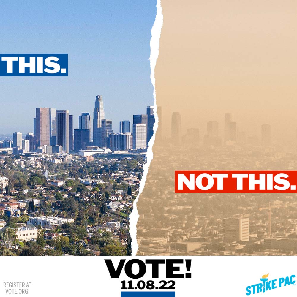
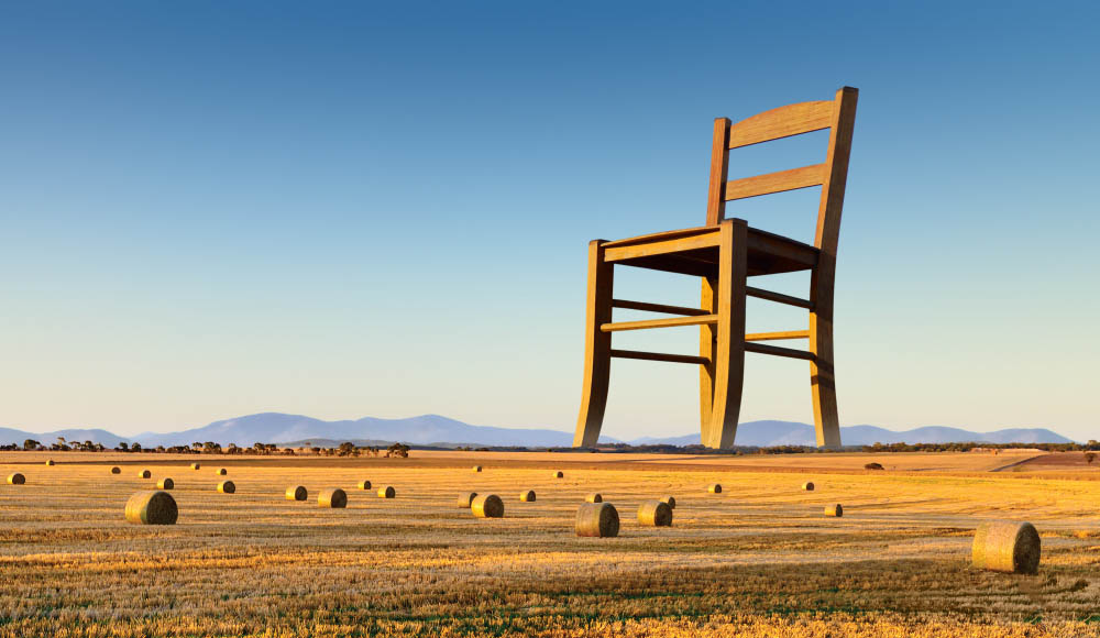
Jumping forward several decades, the 2020 and 2022 political campaigns I developed with Dave Hackel were based on contrasting images, juxtaposed more literally, and matched to communicate a message. Where possible, to enforce the contrast, I found or composited images that had visual consistency.
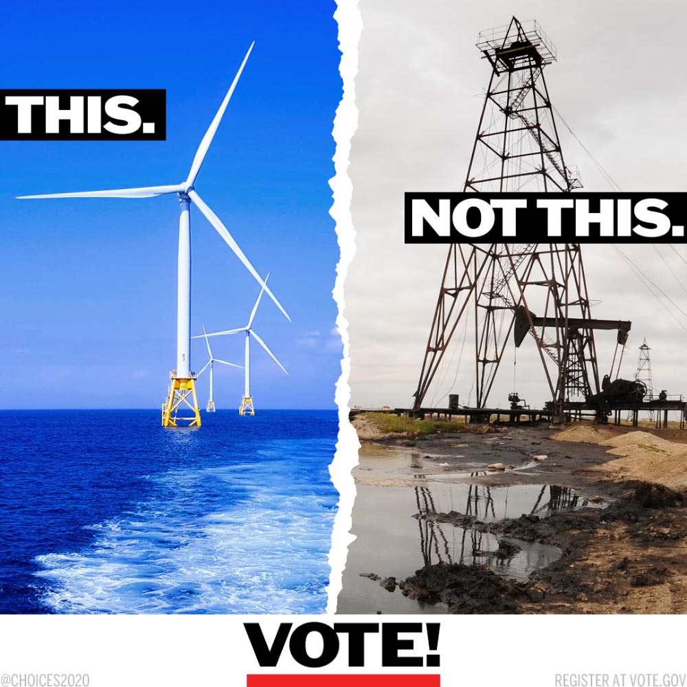
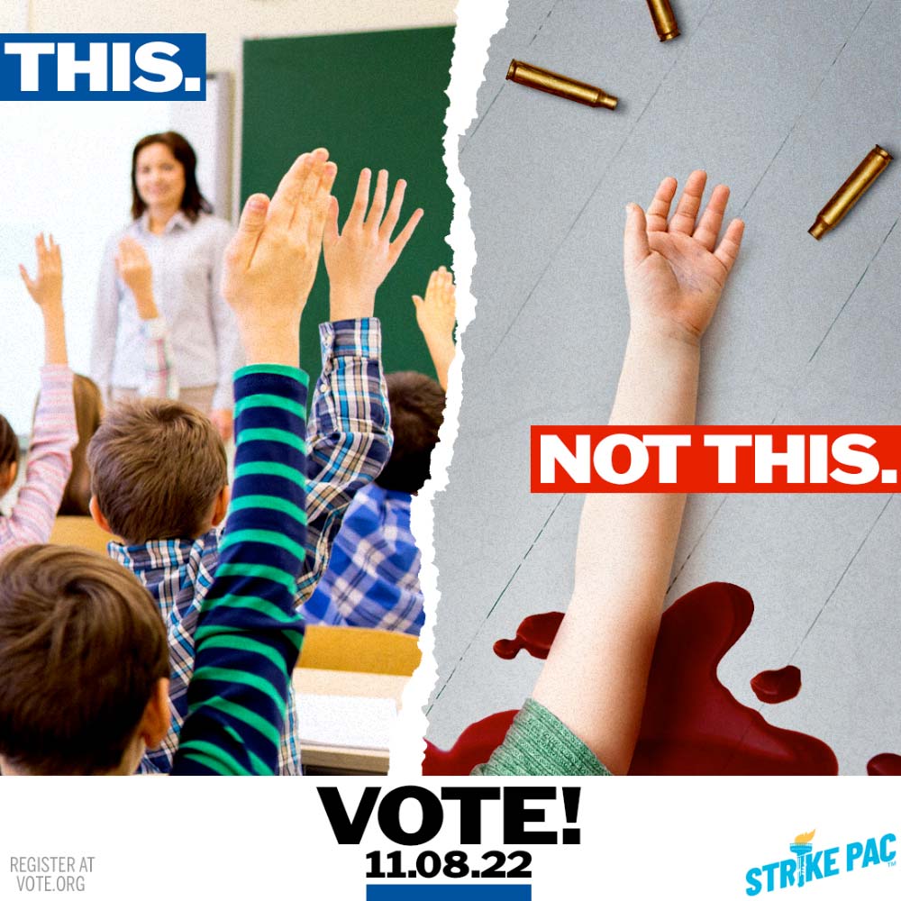
In a couple instances I was able to create a pairing using what appeared to be the same scene.
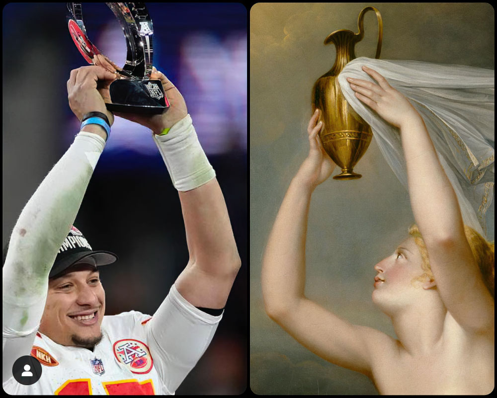
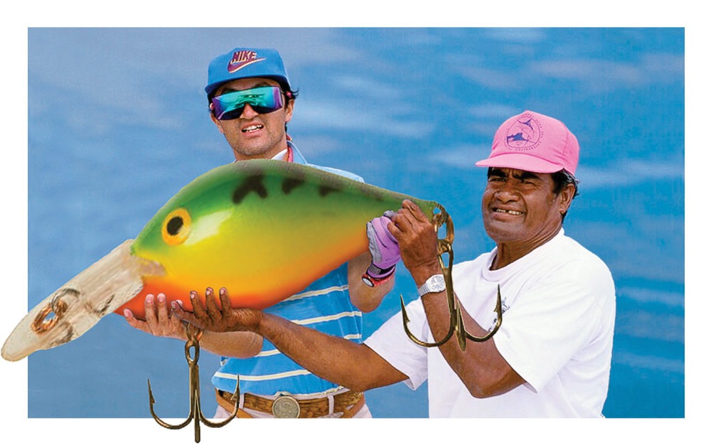
In a similar vein is the work of JR Rader, who publishes under the moniker Art But Make It Sports on Instagram. He juxtaposes sports photos and images from the world of fine art; the similarities often are uncanny, especially given the disparate sources of the images Rader pairs up.
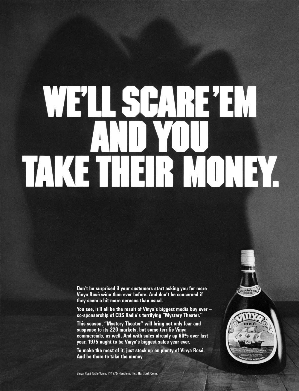
The effect is not limited to photographs. In advertising, for example, a headline and visual that lack meaning and have little significance relative to the product on their own can, together, make a compelling statement.
The juxtaposition of different letterforms or type and an image — in a logotype, for example — can form the visual basis for a unique brand identity.
Graphic elements also can be combined so that one component takes on two meanings, such as with the artist palette / golf green in the Artists Golfers Association logo.
I find humor in virtually all these sorts of images, and no wonder — humor, after all, is based on the same principle: It puts two things together than don’t belong together, which are incongruous and unexpected. And there’s a surprising quality, or twist, to the best humor.
Here’s a piece I did to adorn the cover of a CD I made, compiling songs recorded by myself and a group of friends (The Outboys).
Think what you will of the above, but note Pablo Picasso’s assertion: “Ah, good taste! What a dreadful thing! Taste is the enemy of creativeness.”
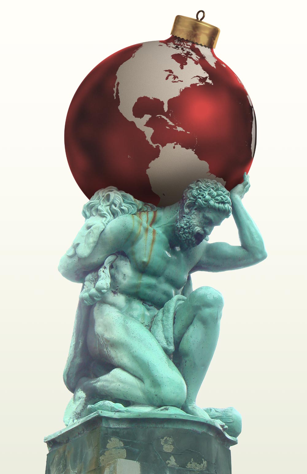
The meaning of juxtaposed images might well be more enigmatic than in the branding, marketing and packaging images shown above. As a student I was introduced to the work of Surrealist René Magritte, who said about putting seemingly unrelated objects together, “It is a union that suggests the essential mystery of the world. Art for me is not an end in itself, but a means of evoking that mystery.” His images are dreamlike in their irrationality, and I’ve taken great inspiration from them over the years.
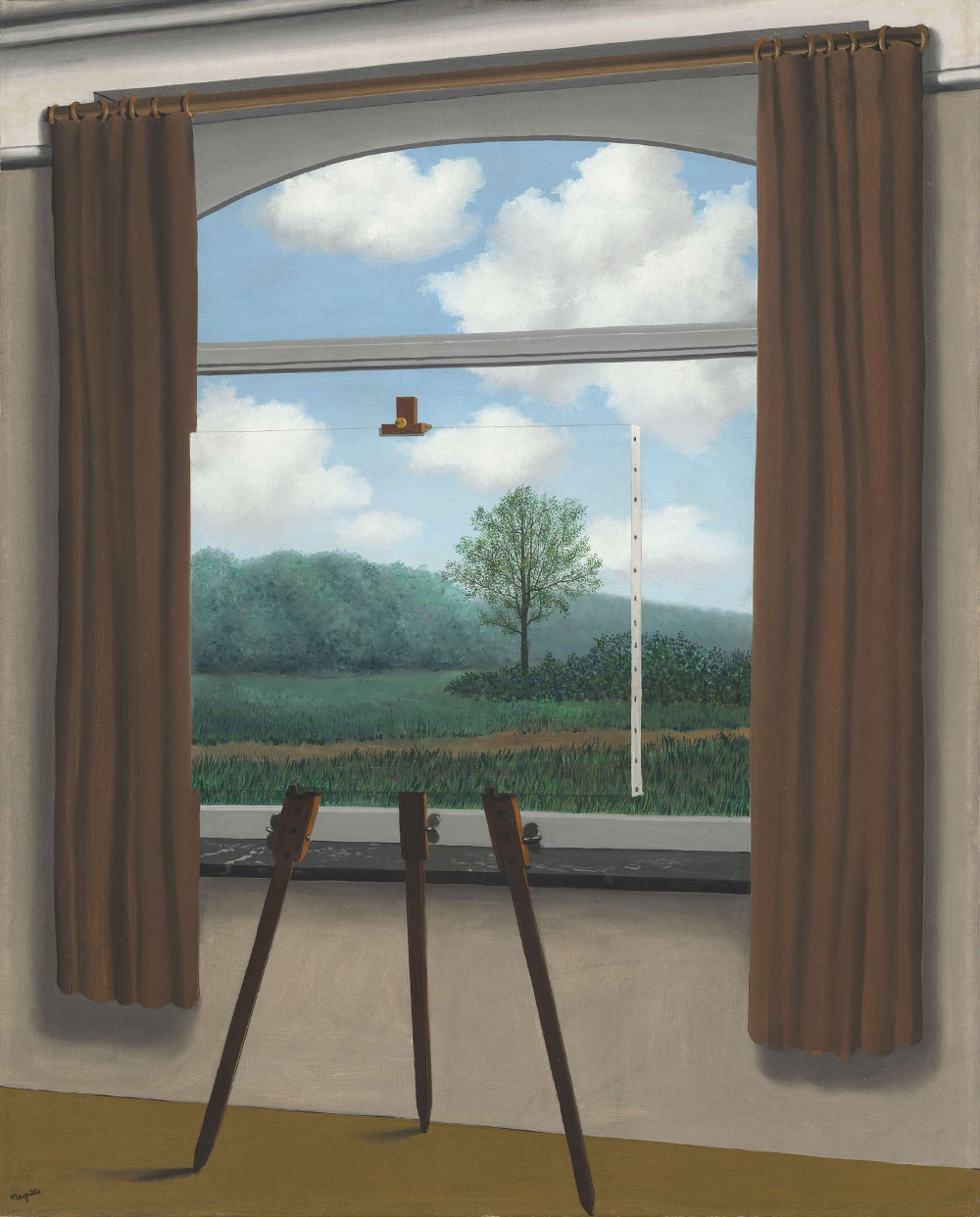
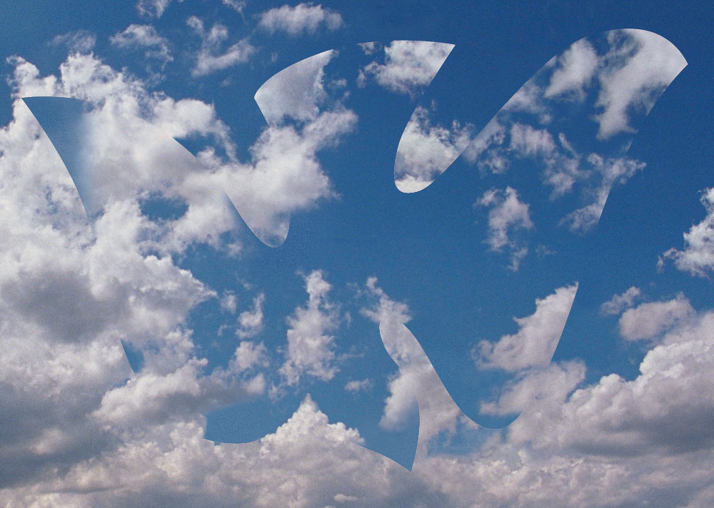
In 2002 the U.S. was on the verge of attacking Iraq, ostensibly because of its ties to 9/11 (proven bogus) as well as a threat the George W. Bush administration was claiming, that Iraq held “weapons of mass destruction.” The weakness of their claims was obvious to many, and we doubters were proved right. For our holiday card that year I created this image, a dove of peace. Only later did it occur to me that I might’ve drawn inspiration from Magritte’s images of birds and clouds.
Echoing Magritte, Albert Einstein observed, “The most beautiful thing we can experience is the mysterious. It is the source of all art and science.” The enigma, the mystery, is an essential component of the appeal of these types of images.
. . .
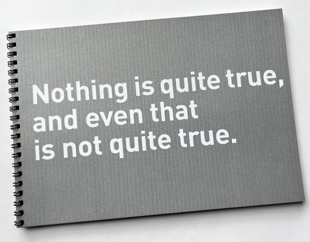
In 2009 I compiled several of my favorite montages into a book. The quote on the cover, attributed to Multituli [aka Eduard Dekker, a 19th Century Dutch writer] expresses the non-sense embodied in most of the images of this type I admire, and that I’ve created over the years.
A few of the images I included were created as parts of design or advertising solutions; some were created for holiday cards; and others were made just for fun. Represented are paper collages, images composited in the darkroom, serigraph (silkscreen) prints, and montages produced entirely on the computer.
Juxtaposed on the pages of the book were some quotations that illuminate the nature and process of creating this sort of imagery, and working in the field of commercial art in general. First among them was Dada and Surrealism pioneer Max Ernst’s description of creativity as “the marvellous capacity to grasp mutually distinct realities and draw a spark from their juxtaposition.”
Following are two images from the book, captioned with the quotes they were paired with.
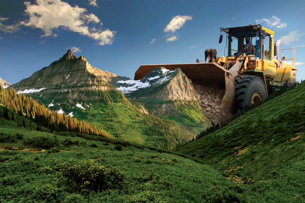
The above image was sent out on a postcard, one of only two self-promotional mailings I’ve published in my career. On the back was this text:
With a sound strategy and the right tools, extraordinary tasks can be accomplished. Here, Mike Diehl can be seen relocating a portion of the Teton Range. For you, he can tackle jobs of any scale, in the realm of marketing, branding, advertising and graphic design for print media and the web.
Below, a couple images I’ve made since publishing the book.
. . .
I must pay tribute here to Lou Beach, an artist who began his career creating magazine illustrations and art for album covers, and who’s been a great inspiration over the years. While he still is commissioned to do album work, his art has evolved into sublime realms; the medium still is cut paper but the images have taken myriad forms and embody everything wonderful about juxtaposition, and so much more. (Lou is also a brilliant writer.)
. . .
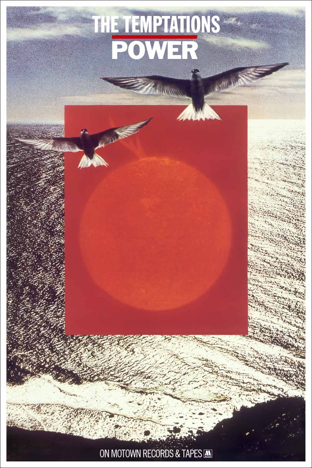
I’ll close with this: In the late 1970s some friends moved into a house in Leucadia, a small beach town north of San Diego. I made this collage and gave it to them as a housewarming present. A couple years later I borrowed it back and presented it as a possible cover for an upcoming Temptations release, and they chose it — my first published montage.