in movies and television. As props they are used to illustrate and dramatize story points, and to inform the audience that something occurred on a specific date. They’re often pictured in more incidental ways, too — folded up under a businessman’s arm, for instance, or stacked on a desk, coffee table or office credenza. Though news increasingly is consumed electronically, the significance of a printed newspaper onscreen is immediate.
If a newspaper is shown in a documentary, it’ll be a real paper. In dramas, comedies and other fictional genres, however, articles appearing in a newspaper are made up to convey, enforce or augment the story line. To be convincing, a prop newspaper must look legitimate.
As a prop designer I’ve created quite a few newspapers — some from the ground up, some reconstructed from scans, microfilm and online sources, and some hybrids. Here are a few of them.
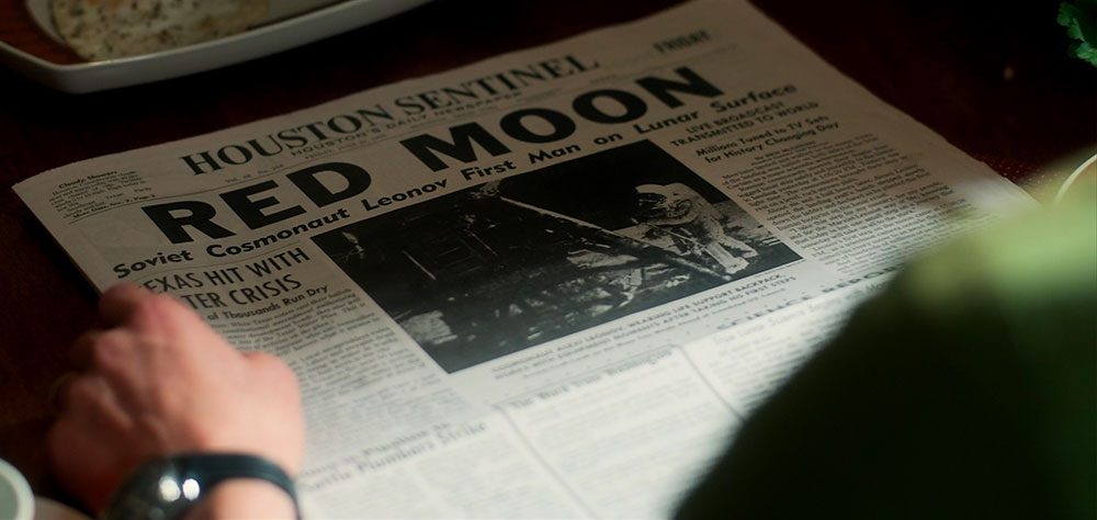
For All Mankind
In Apple CEO Tim Cook’s March 2019 announcement of Apple TV+, a paper I produced for one of Apple’s original series was featured in the presentation video. As of this writing, the series hasn’t aired yet, but this shot offers a clue to the story line. [Click photos to enlarge.]
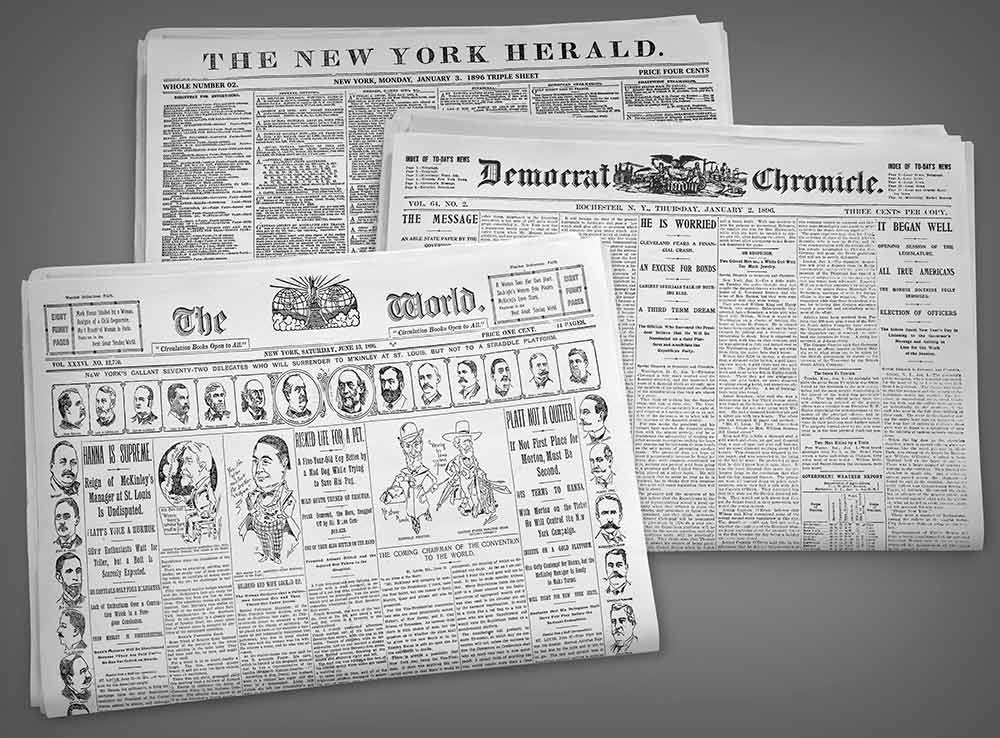
The Alienist
This dark series takes place in New York in the 1890s. Several papers from that period were used as originally published; due to copyright laws, papers that old are in the public domain. My chief task was to make them look brand new — hot off the press, as it were.
It amazes me still just how much copy appeared on those pages.
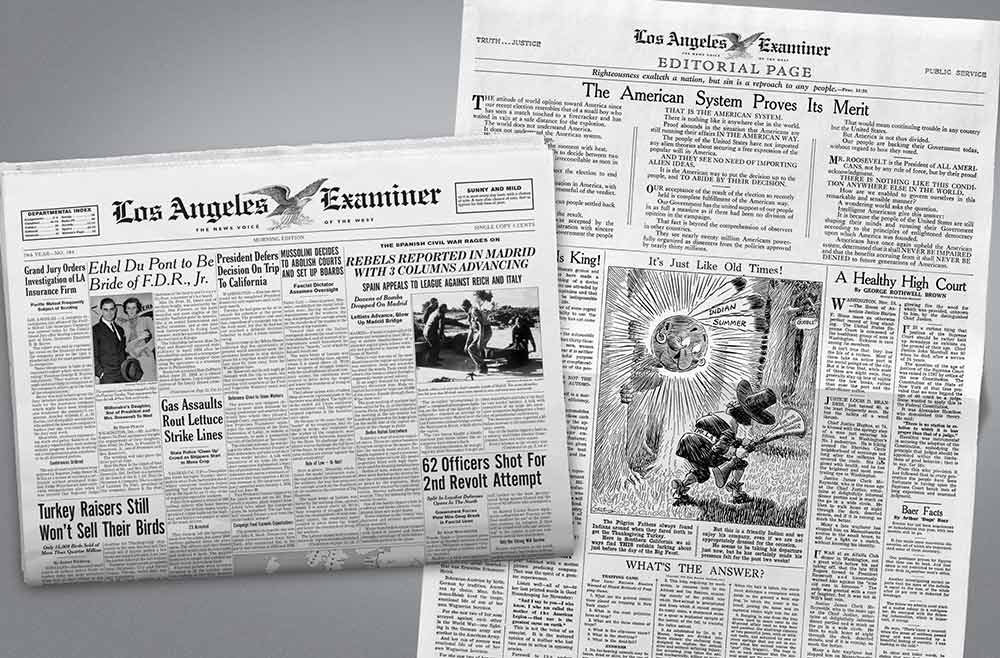
The Last Tycoon
For this series, which centers on the movie business in the 1930s, I created a paper fashioned after several of the era. The layout borrows from earlier publications (the density of material) and papers that followed (bigger headlines, and a variety of fonts, some sans-serif).
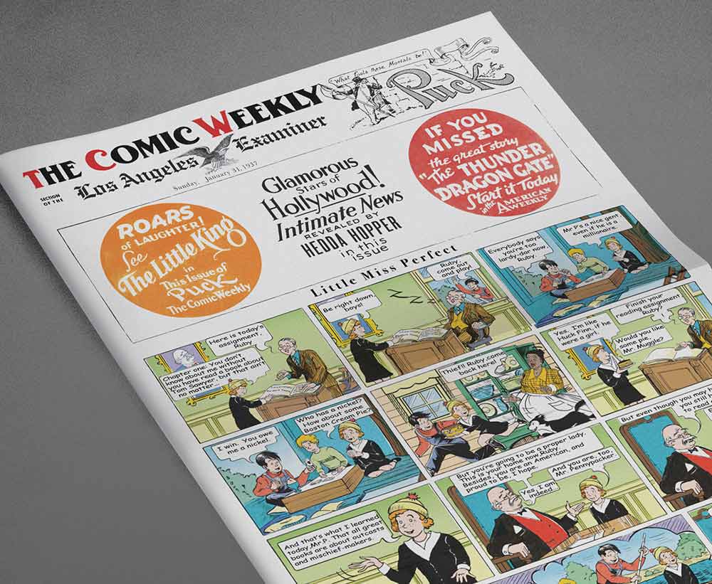
As a vehicle to announce that Hollywood gossip maven Hedda Hopper’s column would be appearing in the Examiner, we made a comic section for the paper. This was one of those hybrid pieces I mentioned — elements pulled from various sources, and assembled and customized to suit our purpose.
Mad Men
As with the Alienist papers above, most of the papers I produced for Mad Men involved cleaning up existing papers. Those were seen on camera under the arm of an ad exec stepping out of an elevator, for example, or sitting on an office desk. Some assignments, however, were more challenging, and some stories fairly amusing.
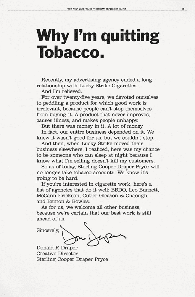
Arguably the most impactful use of a newspaper in Mad Men was the full-page New York Times ad that creative director Don Draper took out following his agency’s loss of the Philip Morris account. Many hands took part in the creation of this high-profile ad but mine were the last to shape the design before it went to press.
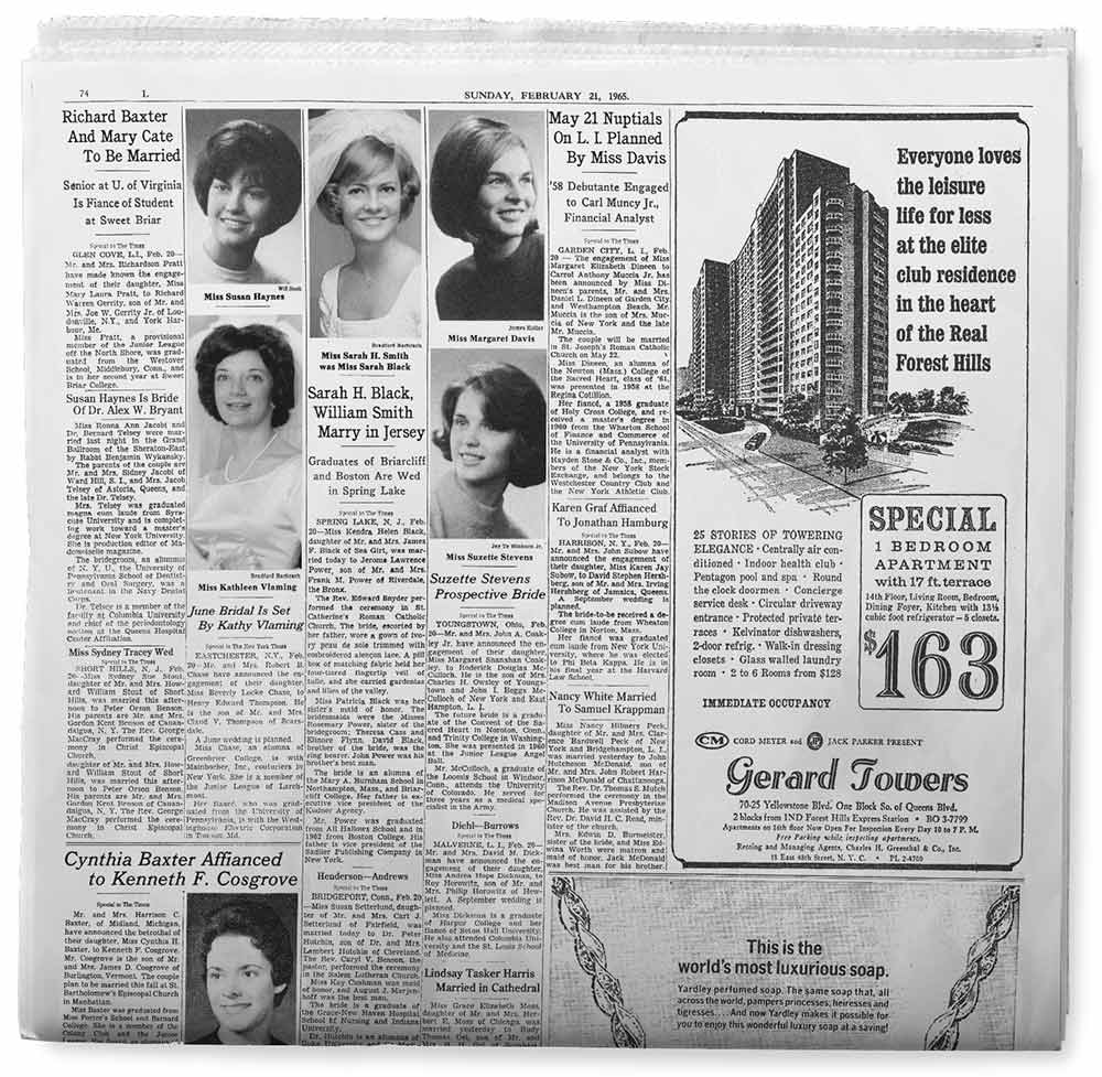
To illuminate the plot point of account executive Ken Cosgrove’s engagement I built a Society page from the ground up.
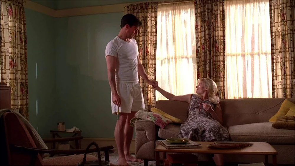
In Season 4 Don Draper visits the widow of the man from whom the ad man stole his identity, after the original Draper was killed in the Korean War. Anna had been painting her living room wall when Don arrives, and he offers to help. Considerable time was spent finding and cleaning up many pages from the November 1, 1964, Los Angeles Times — the day Don stopped by, according to the script — and those papers ended up spread across the floor in the corner of the room being painted. To series creator and show runner Matt Weiner, authenticity and attention to detail knew no limits!
For most of my life I’ve enjoyed reading and looking at periodicals, so it’s fun to be able to invent them for motion pictures and television. Not the least of these pleasures is perusing actual papers, seeing what editors considered newsworthy, and how the news of the day was presented. In shots of newspaper headlines, Mad Men represented many news stories of the mid-to-late ’60s, when I was becoming attuned to national and international news. It was fascinating to revisit many events, from the 1965 Clay–Liston bout to the moon landing, through major-paper news stories of the day.
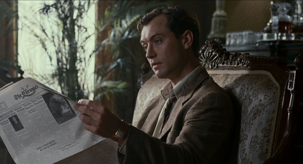
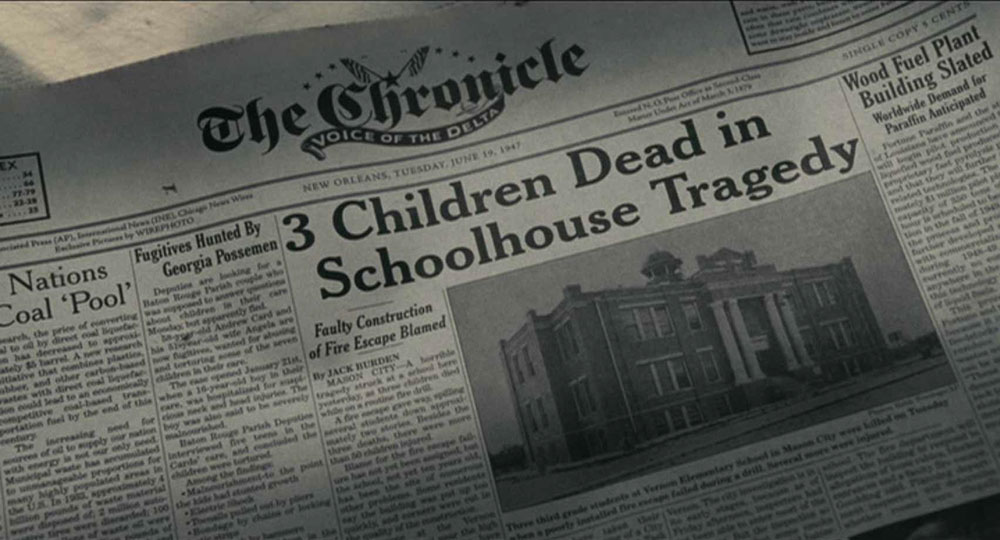
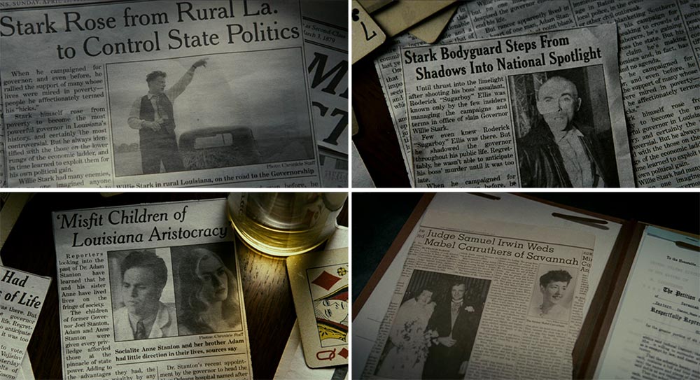
All the King’s Men
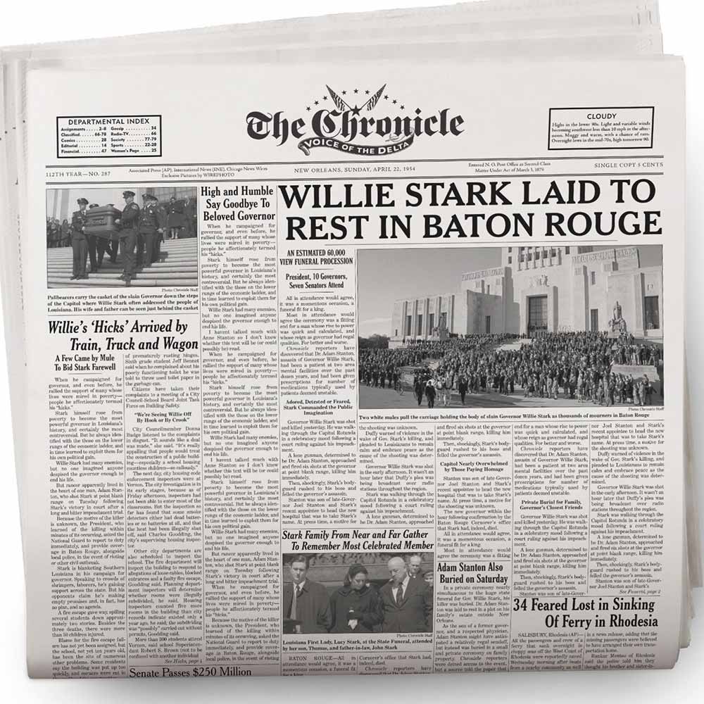
Of the dozens of productions I’ve worked on, All the King’s Men, directed by Steve Zaillian and starring Sean Penn, relied the most on newspapers to convey and add urgency to story points, but also for mood and color. I created the Chronicle masthead and laid out the papers. Featured headlines and subheads were, of course, written into the scripts, but to flesh out the papers, I functioned as editor, photo researcher, cub reporter and ad manager.
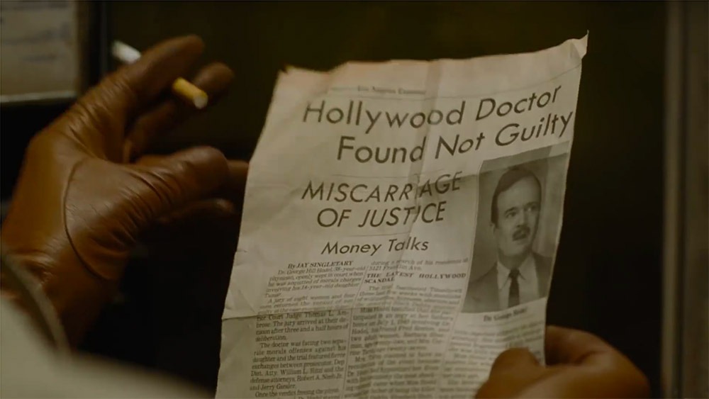
I Am the Night
Newspaper design changes with the times, so layout and typography will reflect current fashion — to a degree, anyway. All the King’s Men took place in the early 1930s, while the paper below, from I Am the Night, was ostensibly published in the 1940s. In its liberal use of sans-serif headline types, the latter paper appears more contemporary, and the loose letter-fit suggests hand-set (Ludlow) typesetting, the method used prior to computer typesetting, which came into common use in the 1970s.
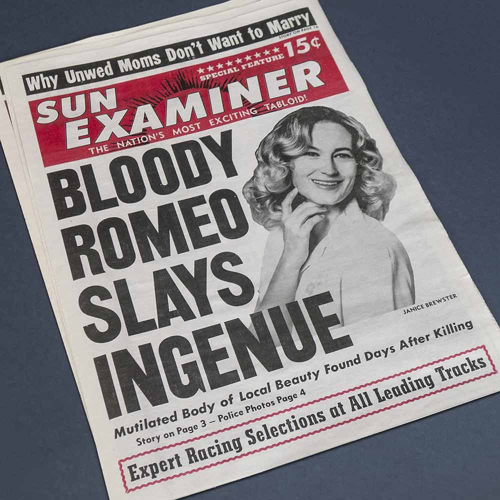
Not all newspapers traffic in serious journalism, of course, so I’m occasionally asked to create a tabloid paper. This one, also made for I Am the Night, portrays an event in the 1960s.
This article focuses exclusively on newspaper props but I’ve designed magazines, journals and books, too — for movies and TV, a few samples of which are seen among my prop-design samples, and, in the “real world,” presented along with other projects designed primarily to inform.